http://mbutler28.wix.com/matildabutlerfmp
DEADLINE DAY!!!!!
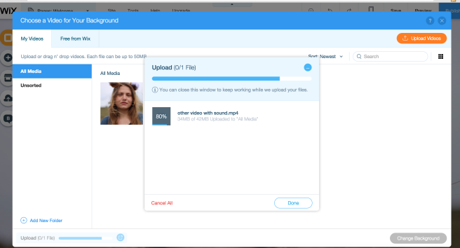
Today is my deadline, and I’ve got until 4 0’clock to complete everything. My final video is up on my website, after some hassle with trying to upload it and the file size being too big, I eventually managed too link a screen shot of one of the frames to my Vimeo page, and I have clearly labeled what you have to do in order to watch it..
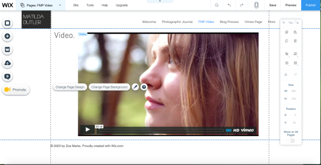
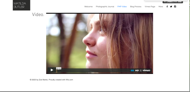
After re-visiting my WIX site, I realised that I could simply embed my video straight to the sight, rather than importing it… This means that everything is in one place, looks smoother, and flows better.
I decided to create a website for my production, completely dedicated to the production process and the final out come. Presenting it as a project, rather than just the final film. This is a fantastic way of involving people, and giving them a stronger insight into what it is about, and where the basis and inspiration comes from! A more interactive method, which is definitely where the future is heading right now.
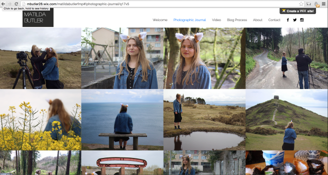
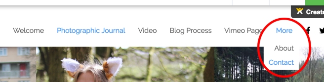
Within my webpage there’s a menu so you can navigate to various parts of the page, and various sections of my work. This includes a photographic journal, a link to my word press blog, the final video, information about the project, a link to the Vimeo projects page and a ‘contact me’ section. Each section are clear and easy to access, which is something I decided was essential during my research into other peoples online presence.

– Menu panel

-Video page… No video uploaded currently because it’s not completed

– By clicking ‘Blog Process’ you are linked directly to my Word Press blog.
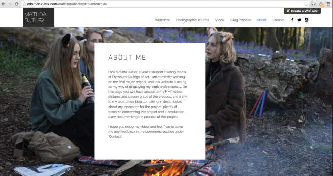
– About me page
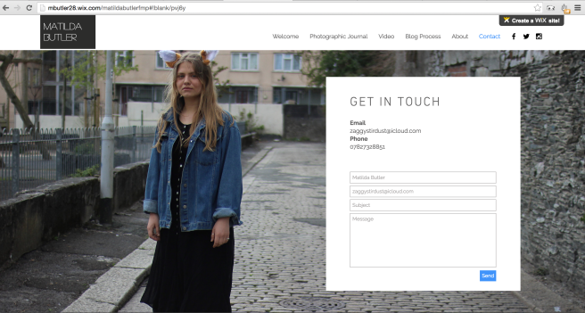
– Contact page (I still need to remove my phone number, it’s not very safe to have online.)
This webpage will be how I demonstrate my work during the summer show, I would also like to have examples of the ears that I created on the wall behind the screen that my webpage will be on, I think this is another good way of interacting with my audience, as well as it being a nice personal touch.
I have no real logo for this, I feel like Dot is the ‘Face’ of this project, so her face can be a recognisable feature, I do however have the image I use for this blog, which admittedly was taken from Pinterest.com and altered on photoshop.
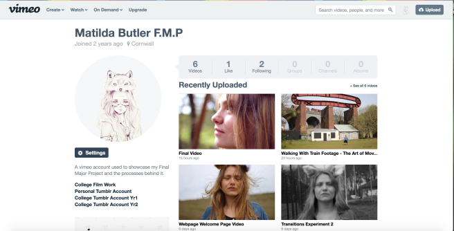
My Vimeo Channel is another platform that’s involved in the project. It is a channel solely hosting videos related to this project, including: ‘making of’ videos, experimentation video’s and the like. I’m using a channel I created 2 years ago that I never got much use out of, and have given it a complete makeover in order to fit my FMP. I’ve created this channel to give an even deeper insight into the work gone into my final piece and the developing journey it’s taken. At the moment there’s very little in the way of video’s uploaded because I am still in the process of uploading them. 
Today begins the final week of my final major project, and I feel a lot of pressure to finish on time. As well as this deadline, I am working on a piece for a friend of mine, filming and editing a music studio session that her and her friend are conducting. This is certainly added pressure, but I have finally managed to finish – lifting a giant weight from my shoulders! Although doing this video is extra pressure, it’s been very helpful in keeping me busy and it means i’ve been really involved in the video making process. It’s also kind of a music video, so it fits very well with my current train of thought. It’s helped me practice cutting in time to the music, and changing the colour of the footage to fit the mood of the footage.
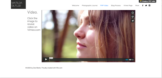
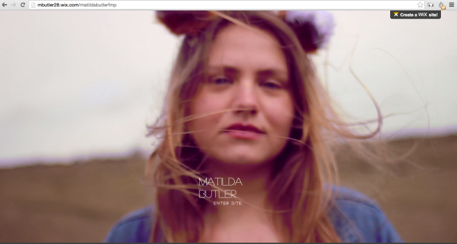
Today I also created a web-page, which enables me to present my work in a much more professional manor, like a real commission would have to. I used WIX to create the webpage mbutler28.wix.com/matildabutlerfmp
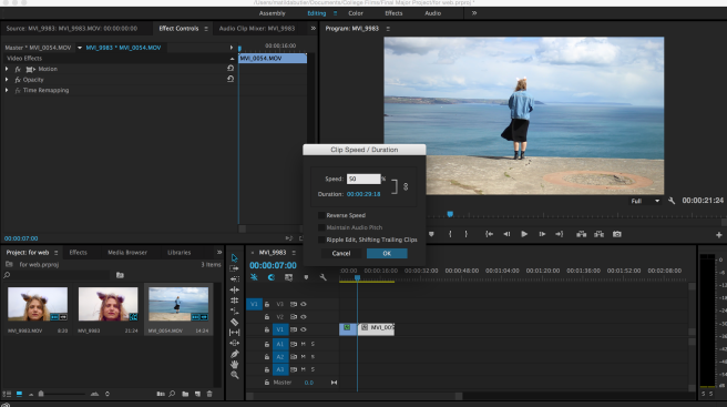
Initially I planned to have the ‘Welcome’ page background a GIF of a clip from my film, so I created one using my knowledge of how to do so on photoshop. It worked fine on my mac however when I uploaded it to my the WIX page the GIF didn’t move. It was after I had put all that work into creating a GIF that I realised that I could just upload my video straight to the website! I then went to premiere and slowed down the footage by 50%, and then added two other small clips both also slowed down by 50%. I then changed the tint of the footage with the Three-Way-Colour Corrector, to give it the pink vintage tint that I am using in my film so that it fits the theme.
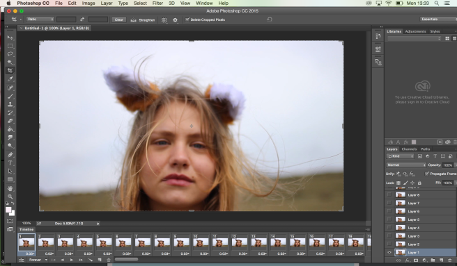
– GIF creating in photoshop
– Editing the film for webpage Welcome page
– Uploading footage to webpage.
I added ‘Vimeo Page’ to my menu navigator, and there isn’t enough space, so it’s now been changed to fit the extra options.
I need to find a way of blending the black and white into the colour smoothly rather than just switching. This is something I intend to do with key frames… In our group screening this morning it was the main thing that my tutor Neil, and the students at my screen suggested that I work on. When I was messing around with the Luma Corrector I discovered that it made a really dark interesting effect, and it uses key frames (something that the black and white effect doesn’t) Key Frames are an excellent way of controlling sound and visual effects. By placing a Keyframe at two separate points of a video clip you can control the when you want the effect to happen, and at what speed, and you can fade it out effectively. This method will work very well with the gradual colour change that I’m trying to achieve.
I decided to try out using just the Luma corrector on my beginning section, with no black and white to see if it would produce the effect that I want. Although it looks nice, there were some clips that became a bit too dark, so I thought that I had better not risk changing all of the beginning clips incase the colour distorted too much.
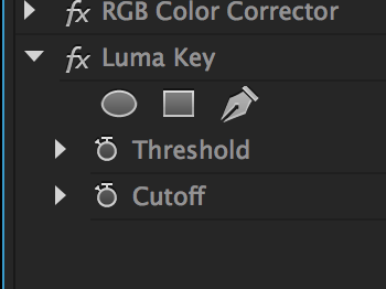
I have decided that the Luma Key could come in handy with my transitioning process though… I felt the most important bit of advice given from my peers this morning was the advice on colour transitioning.
As the black and white effect doesn’t have any blending keyframes I needed to find another technique, so I looked to YouTube for advice.
This video taught me how to transition from black and white to colour using a tool called ‘Calculations’.
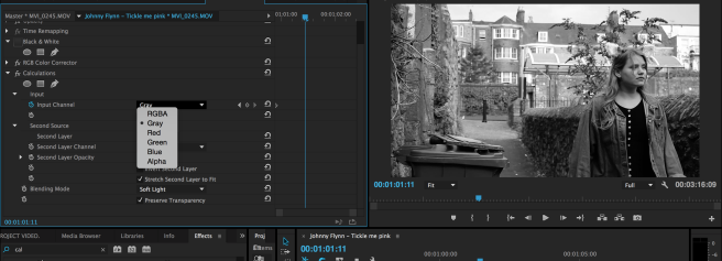
I then add a key frame where I want my footage to begin transitioning into colour, and drag the ‘second layer opacity’ number to 100%.


The second image above is the finished transition frame, colour at 100%. I decided to transition over two clips because it would seem more gradual, and because both clips are fairly short so it drags it out just enough. I’m really happy, it’s gone from a really strange and quick transition from blunt black and white to blunt bright colour, to gradually going through grey and into colour again. I also decided to change the brightness down on the next clip to continue the transition further.
Small Tweaks:
clips rotation: due to wonky tripod/rough terrane.


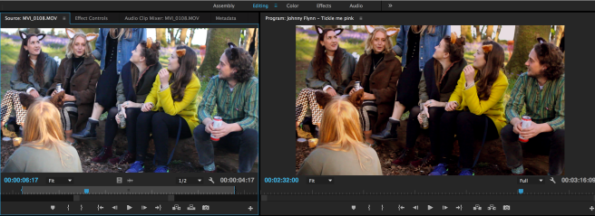
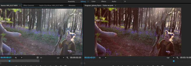
Another aspect of my film that a classmate recommended that I change was the lighting in the party scene. The sun was setting very quickly during the shoot so it was impossible to keep the light the same, and I didn’t shoot the clips in order of time… This is a slight set back, but thankfully I’m able to alter the lighting in post production. The above image and below are examples of how I did this with the Three Way Colour Corrector, and the RGB Colour Corrector effect of premiere.
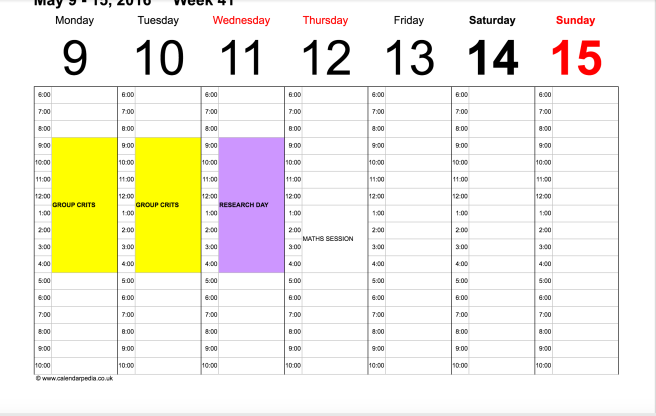
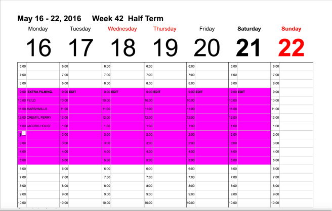
TIME PLANNER
bibliography
Rachel Maclean has a unique online persona, and it’s an excellent example of how much freedom the internet provides for creative professionals to express themselves, yet still be taken seriously. Her tumblr-blog for example, transports you into a pink and rainbow world, with flashy retro effects that you would likely find in word art, or on web-sites such as o-mighty.com. Her style although unique in many ways, is certainly similar to a popular style trending across the internet at the moment.
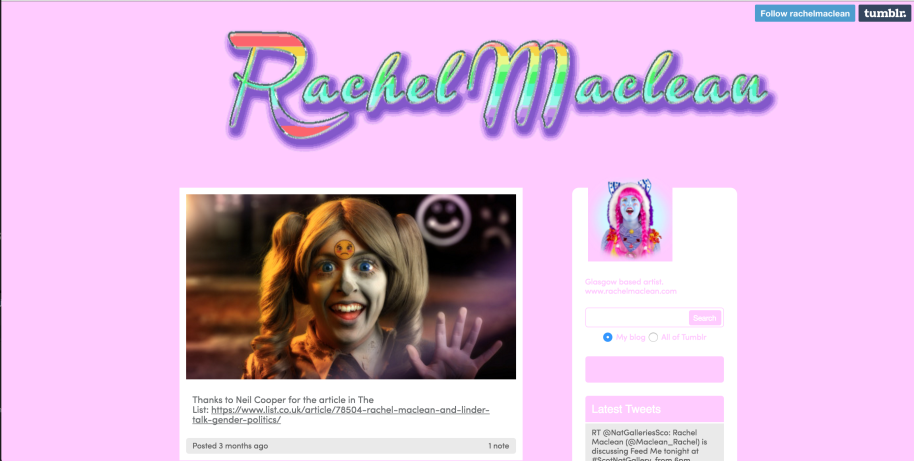
– image above from Rachel Maclean’s tumblr
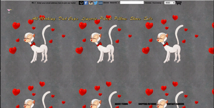
– image above from o-mighty.com
Rachel’s style of presenting herself online fits in with her style of video’s. It would be extremely unusual if her video style was simple and minimalistic, yet she presented herself with bright colour’s such as pink and rainbow. This is something I will need to take into account when presenting my FMP. She uses tumblr, which is a popular blog-spot on the internet at the moment, and definitely attracts the kind of crowd that would show interest in her video’s. Her style is very out-there, in the same way that her video’s are, and I feel that I could take her outgoing approach when it comes to presenting myself online. Although my FMP isn’t full of bright colours and love hearts etc, I’m excited to experiment with different way of representing the animal ears within my online presence.
http://rachelmaclean.tumblr.com/
Spring Studio’s take a very different approach to promoting themselves. With a very minimalistic website using black and white and small lettering. They share a similar technique in relation to keeping within their style though. The ‘look’ that they go for is professional, slick and very ‘high fashion’. This appeals to their clientele, and suits the modern aesthetic they desire. They are dealing with clients such as Calvin Klein, Louis Vuitton and Vogue, which themselves all follow this minimalistic, professional image. So it’s very important for them to fit in with their look.
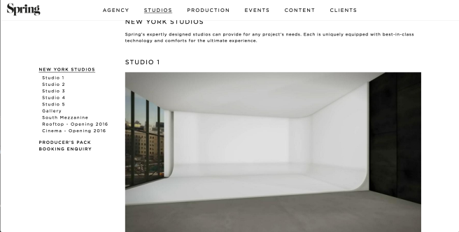
I really like the way they have so clearly laid out their page, everything is easily accessible, and I appreciate the different sections within the page. I would like to display my work similarly with different sections.
Similarly, Chris Milk – Photographer and Filmmaker, takes the minimalistic approach. Presenting his webpage in a grey font on white background, bold format. Which I think works very well as his last name is milk. His work is displayed in a very professional manor, which isn’t necessarily eye catching, however does fit into a high-class expensive category. – I feel like Apple’s immense success has somehow made the world monochrome. Again, much like Spring Studio’s. Chris Milk has worked with very ‘high end’ clients, such as Kanye West, Johnny Cash and Gnarls Barkley. He has this information displayed in his bio, helping promote this image, and therefor attracting well paying customers.
“Chris Milk’s work has expanded beyond the traditional: his art straddles experimental genres and unfamiliar mediums, turning new technologies, web browsers, ephemeral events and even physical gestures into new found canvasses. His work continues to test the frontiers of interactive technology and art as Founder and CEO of Vrse, a virtual reality technology company, and Founder and Creative Director of Vrse.works, a virtual reality production company. Milk presented at TED in 2015 on the power of virtual reality as a medium to advance humanity.”
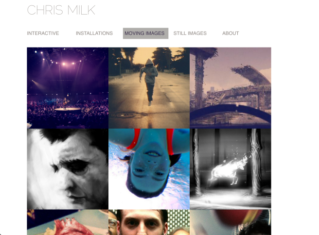
He displays his moving image links in a simplistic box format, which works very well within the website and the bright colours catch the eye, and the thumbnails are strategically placed to reveal a different array, promoting his abilities diversity.
I was scanning through the interactive section, and noticed underneath each video there was a list of awards it had won are various film festivals, and places they had exhibited. This is again a good tactic at self promotion.

Chris Milk’s method of self promotion using his Bio, and his way of using a white back ground to make the colours in his video pop have influenced my ideas for my online presence. Initially I thought his style was very generic – which I do still think. However, I respect his use of simplicity in regards to drawing attention to the film, and it being about the beauty in the film rather than being distracted by the web-page.
My online presence shall be a strange combination of the two extremes that I’ve been researching. Although I admire Rachel for her bold presence online, I feel that perhaps her blog and web page may distract people a little bit from what she is really about. On the other hand, it does work in her favour because it attracts the attention of her target audience, and if they know where to look they can find her stuff. For me, however, as I am not yet an established name online I need to find a way of balancing the bold-ness, and the simplicity. I shall do this by using paler colours – perhaps pastels, however keeping with the interesting animal ear theme. I shall play on that.

FILMING
Today is the final day of filming, and I’m very excited to finally get everything completed .I had some issues with timing and ensuring that my actress and actors were able to be in my film, and for the owner of the house to be in etc.
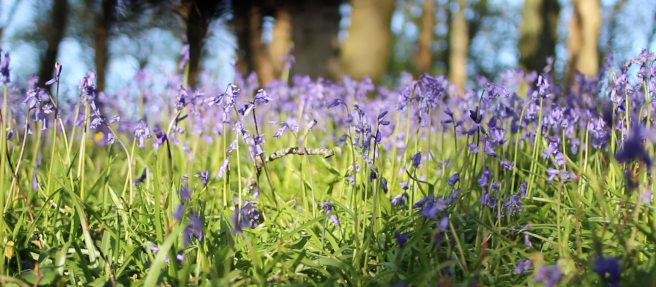
On our way to Marsh-mills we stopped of at a rape-seed field to film. Which at this year blooms beautiful yellow flowers! As shown previously, filming in the woods I was blessed with hundreds of bluebells covering the woodland floor. Purple and yellow are opposite on the colour wheel, so the contrast within the film is going to be very special.


My next filming location was Marsh-Mills, Plymouth. Which is a graffiti’d area near some roads and a train track. This location is somewhere I had been meaning to film since the very beginning of my project however there was always something holding me back for being able to film there.
Filming in this location didn’t take very long, I only needed three shots. The aim of filming there was to capture very urban, ‘concrete jungle’ shots, but it proved harder than expected because there was a beautiful river flowing through the middle. For some reason I keep finding the prettiest places in Plymouth by accident, rather than the grotty ones… I think this speaks for it’s self that there’s plenty of beauty hidden within the city walls. – I found this driving through some of the streets in Plymouth as well. I noticed lots of the roads were hard to drive along because the tree roots had overpowered the concrete and caused it’s once flat surface the crack. It felt like nature was making a come-back.
We then moved on to begin Cremyl ferry filming. I needed my dad to act for me as a fellow animal, however the ferry had arrived, and it’s safe to say his acting skills aren’t great, so I didn’t manage to get the shots I needed.
Below are screen-shotted evidence of my dad’s horrific acting… His role was to walk past and smile.


One we got on the ferry, it was quite busy but luckily there was only two people sat outside the back of the ferry, where I needed to film, and they kindly moved to one side for us. i got some shots of Dot, and the semi-begged the ticket man Max to put on some ears and be filmed for me. Reluctantly he agree’d… and I got the shot! After the ferry, it was time to get the opening shot, inside the house.

Three of my friends live in this house, and they agree’d to be actors, I also called over a few other friends to help with acting. The boys who live here often have parties, so I relied on them to provide the empty beer bottles. As predicted, there was a whole recycling bag full of them! Which I laid out on the floor and on the table in the living room. It took me a few takes to get the intro right… I initially planned to get a shot of them together and then slowly pan to dots face, however it was very tricky to move around without a fig-rig. (it’s half term so the ERC is shut) So the footage was a bit jolty. To make up for this I decided to get some cut away shot’s of various people asleep, and of beer bottles, to introduce the mis en scene.

Editing
Today I began editing my final film, and to start I would need to be organised. I sorted the footage from each filming session into separate bins on premiere. And labeled them:
 As you can see there is a lot of footage, because I thought it was important to get to much rather than too little. I found it really useful to organise the footage into these different bins because it meant I didn’t have to scroll through hundreds of thumbnails just to find the clip I want.
I then dowloaded the song, and began the process of adding my first bits of footage.
After a while of messing around with the contrast etc, I had a revelation in regard to how I would present the beginning ‘dark-city’ section of my film. Much like in The Wizard of Oz which begins the film in sepia, I could begin my film in black and white. A colourless place, and then when she goes over to the lighter side the black and white transitions into colour.


– in order to keep my dingy theme I will need to mess around with the contrast, and RGB colour corrector.
More editing
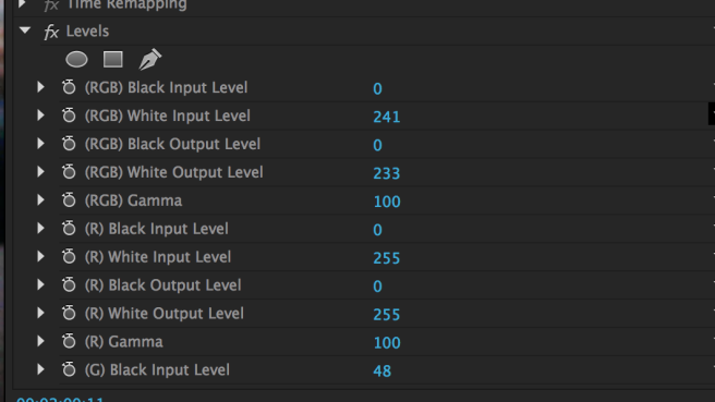
I have decided that the coloured footage is to have a vintage tint to it, bringing out the red tones. In order to achieve this I have to play with the different Levels. I messed around altering the black and the white input levels, until I got the tone that I wanted, and then copy and pasted into onto the other coloured clips. This worked for most, but due to the different in light between different locations I had to then go back and alter them slightly, so that they were level with the other clips.
I am also having doubts about my music choice, which is a nightmare at this point. Instead of going back and spending ages choosing a different song I have decided to persevere with this one, however have a backup edit that I can look into in my spare time. My doubts have only arrived because of the speed of the track… I feel like it’s rushing the story and it’s not being brought across clear enough. My thoughts are to perhaps use a more ambient track. I need to avoid driving my project away from being a music video though, but I still feel that I want to use a longer, less upbeat song.
To fit in with the folky/vintage style that I am going for, I asked a friend of mine to file transfer me some ‘Burns’ which you can layer onto footage to either add light, or give it a vintage/old film affect! I’m still unsure in them, as they are slightly cliché, but I’m excited to try them out.
I have nearly completed my initial edit, I just need to finish it, and then I will begin chopping and changing. I’m having strong doubts about the start. I feel at the moment it doesn’t quite convey the dark city I was hoping, and the people don’t seem menacing enough. I’m going to have to make a decision soon about whether it’s worth re-shooting the opening scene with the deadline so near.
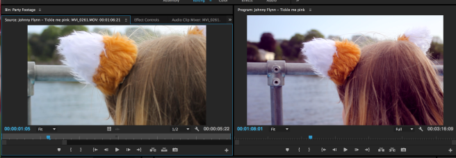
Today I spent more time working on my film, finishing it up so that’s i’ve got something whole to work from. I also continued with messing around with colour effects. During the ‘party filming’ I was filming at dusk, so the light was changing every minute… This means that lots of my footage has very different lighting. It doesn’t really work when there’s some shots that were filmed in the light, that I want to put after some shots in the dark… In order to amend this I’ve been messing around with the Three Way Colour Corrector. To try and give some orangey tones. In particular I did this with an ECU shot of Dot’s face. I tried to make it seem like she was looking into the fire. Unfortunately there’s still some blue sky in the background, but I’m going to have a look on lynda.com, and try and figure out a way on tinting that. I also zoomed the shot so there was less of the sky in frame.


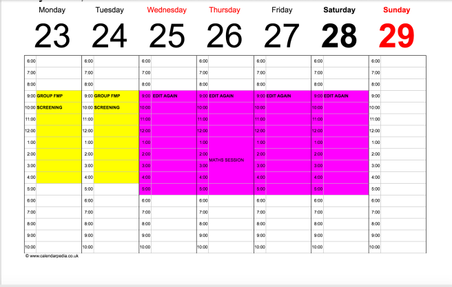
TIME PLANNER
group crit…. maths session…